How To Create Dramatic Vector Illustrations
- 22 min read
- Graphics, Illustrator, Tutorials, Sketching
- Share in Twitter or LinkedIn
- Saved for offline reading
Quick Summary • I have been drawing desktop wallpapers for Smashing Magazine’s monthly collections for over a year now, and every time it’s a very fun and challenging mission. In this article, I would like to share how I approach all stages of the process and provide general techniques for creating vector illustrations in Adobe Illustrator. Hopefully, you will find these techniques useful. While referring to a particular drawing — the illustration for the “Understand Yourself” desktop wallpaper, which was featured in May’s wallpaper collection this year — I’ll also highlight key takeaways from my experience as an illustrator and designer.
 I have
been
drawing desktop wallpapers for Smashing Magazine’s monthly collections for over a year now, and
every time it’s a very fun and challenging mission. In this article, I would like to share
how I
approach all stages of the process and provide general techniques for creating
vector
illustrations
in Adobe Illustrator. Hopefully, you will find these techniques useful.
While referring to a particular drawing — the illustration for the “Understand Yourself” desktop wallpaper, which was featured in May’s wallpaper collection this year — I’ll also highlight key takeaways from my experience as an illustrator and designer.

The idea for “Understand Yourself” derived from my curiosity about the future relationship between robots and human beings (artificial intelligence has become a thing recently). How would a robot go about understanding human emotions? By doing the same things that people do, of course. Hence, a pensive robot staring at the sunset.
Let’s take a closer look at it and see how it was made.
More after jump! Continue reading below ↓
Things To Consider Before Getting Started
- Resolution. Although vector artwork is scalable without compromising quality, you have to decide on the ratio. I prefer 4:3 and 16:9 because these are fairly common standards for most screens. Also, bear in mind that, despite the perfect scalability of vector graphics, working with curve anchors and colors in small areas is sometimes onerous.
- Composition. Rules are made for breaking. But we should know which are supposed to get broken, right? One that I really like is the rule of thirds. It is easy and it works well. The key idea is that main objects should be located at the intersections of the grid lines. If you are willing to learn more about composition, I can’t recommend anything better than the book Framed Ink.
- Depth. To make an illustration look more natural, create depth. You can achieve this by placing some objects closer to the viewer and some farther.
- Framing. Don’t fret that some of your artwork will get trimmed; account for it while drawing. The rule of thumb is to think of your illustration as a clipping from a much bigger picture. While drawing, don’t try to squeeze all objects into the canvas; let them hang out. This is even more relevant if you are planning to turn your artwork into a wallpaper with multiple versions.
- Detail. Adding detail is a great way to make your illustration more attractive. The more thorough the work is, the more one will want to explore it, and the more truthful it will look. On the other hand, adding detail might (and most of the times does) take a lot more time than creating a decent illustration that you are satisfied with.
- Perfection. Don’t be afraid to make mistakes. There is always someone (future you, as well) who is better at composition and coloring. Your drawing won’t be flawless, and over time you will notice a lot of things you didn’t pay attention to or just missed. At the same time, the only way to learn something is to make mistakes. That’s how it works.
It's All About Storytelling
Since the dawn of the human race, storytelling has been one of the most exciting forms of communication. It teaches, it captivates, it makes us think.
An illustration might look static, but it doesn’t have to be. Creating a story within a still image is easier than you might think. All you have to do is to imagine that your artwork is a middle frame of a movie. Technically, a movie is a sequence of images played at high speed, so that the eye doesn’t notice the change of frames.
Think about what happened before the frame you are working on and what might happen after. Let’s think about what’s happening at the moment as well. What led to our frame? What are the causes and consequences?
The art of storytelling is not about what you tell the viewer, but rather how people perceive what you are telling. A good story sources its power from people’s emotions and memories; it resonates with the viewer.
As a quick example, below is one of my wallpapers featured in the August wallpapers collection.

And this is a message I received shortly after it was published, from Paweł Montwiłł in Poland:
I have recently been to a campsite with my children and we spent some time in a tent, so it perfectly matches my mood.
Chances are, what genuinely interests you will be appreciated by others, too.
Background
The background is extremely important because it sets the mood and affects the colors you will pick later for the hero and the surroundings.
Open Adobe Illustrator, and create a new document by hitting Cmd/Ctrl +
N. Type
2560px in the “Width” field and 1440px in the “Height” field.
Choose
RGB color mode, because we
are creating an illustration that will be used on digital screens only. (Note: Shift +
0
activates the artboard editing mode, so you can change the dimensions of the artboard if you
want to alter them or in case you typed them in wrong.)
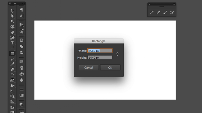
Hit M to select the Rectangle tool, and click anywhere on the
artboard. Type in
the same width and height values as your artboard’s (2560px and
1440px).

Conclusion
Illustration is a great way to boost many of your skills and to experiment with drawing techniques, colors and composition. These skills will make you a better specialist in any creative field (such as animation and web design, to name a couple). Just remember that a solid illustration requires patience and is rarely done quickly. The good news is that it pays off.
 (cm, al, il)


- Comments22
Miro Alt wrote -
Great article! I wish I had more time for this.
Richie Kastl wrote -
Great article! I wish I had more time for this.